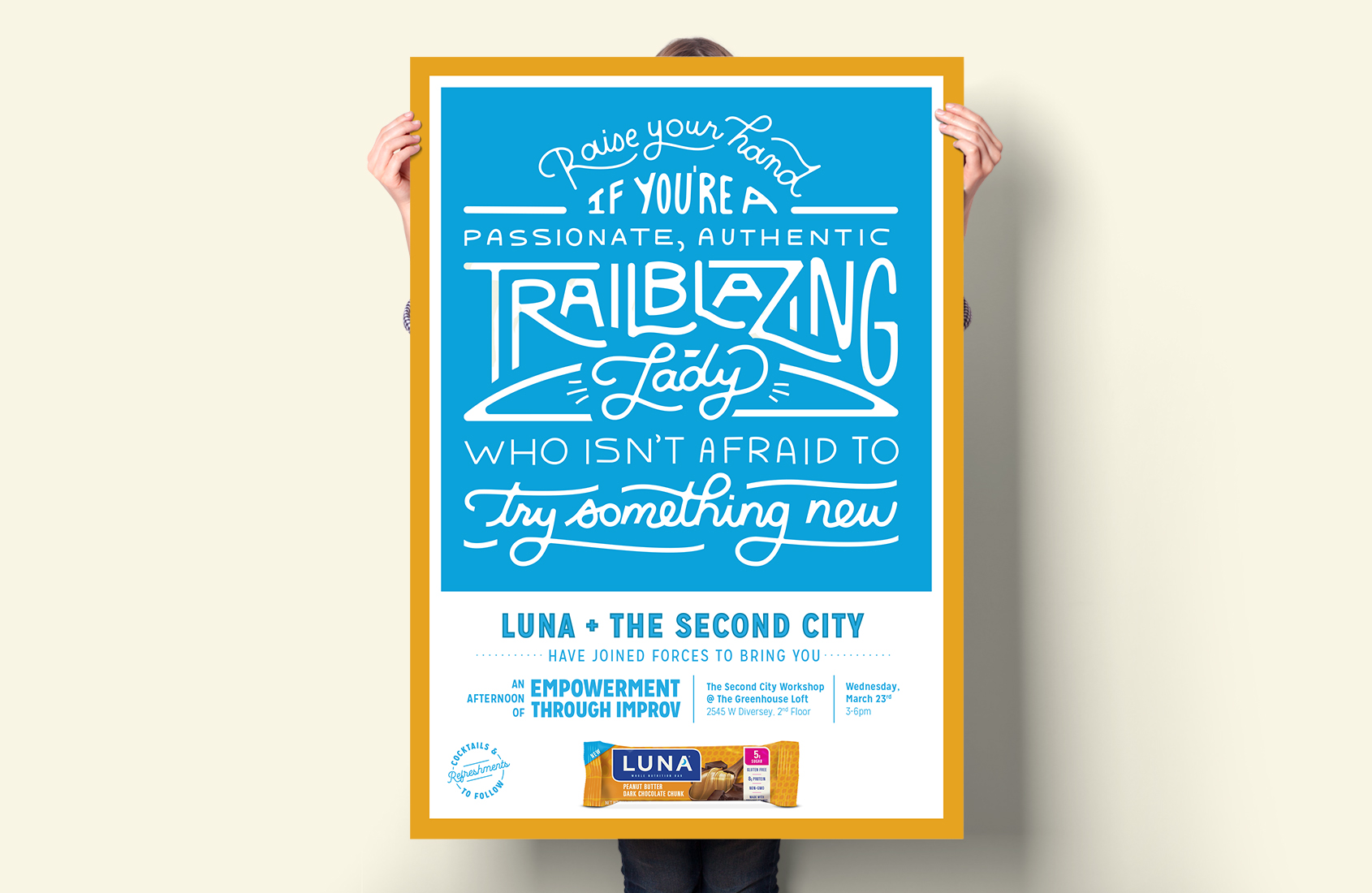
Luna has been a successful player in the energy bar segment since 2000 with its line of nutrition bars targeted towards women. However, the brand had become dated and lost resonance with consumers. We repositioned the brand to focus on four key pillars: empowerment, personal growth, passion and indulgence. Despite immense progress for women, Luna believes that there are still barriers to break through. Glass ceilings. Financial disparities. Cultural pressures. We dedicated the Luna brand to helping women break through barriers so they can boldly pursue life’s adventures.
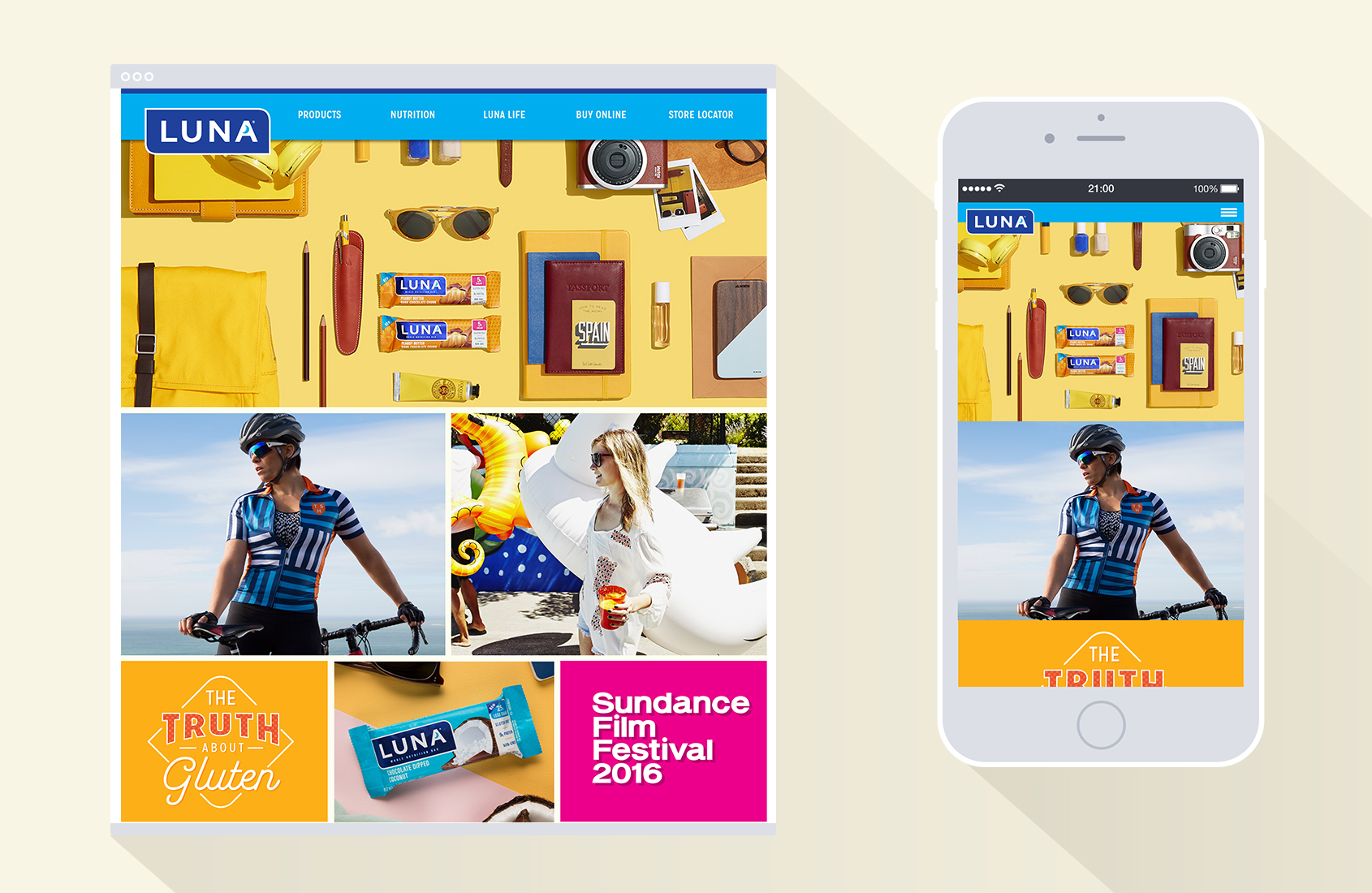
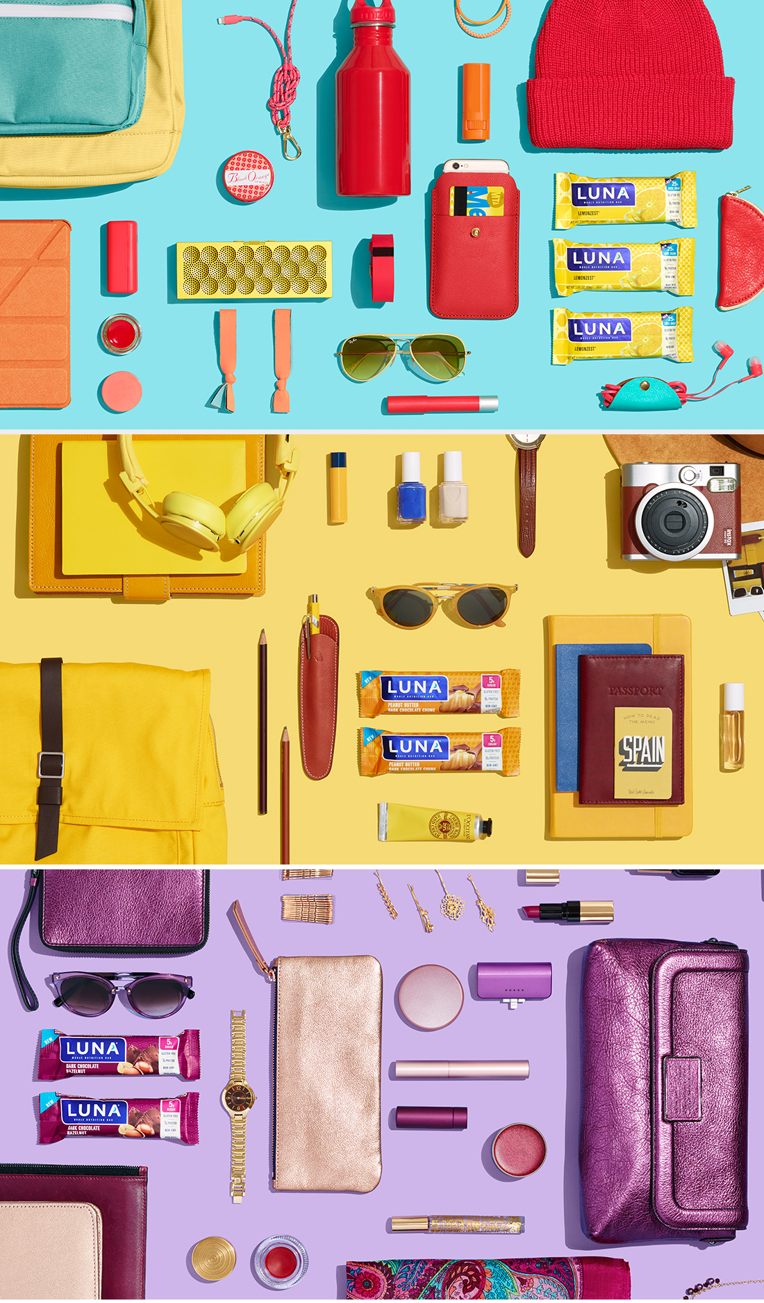
The major overhaul involved a complete redesign of the brand to bring it into the modern world. The logo became bolder and more powerful. Patterns and color were introduced to add personality around each individual flavor. Typography was stripped of it’s traditional corporate feel. Branded content was refocused around empowering women to break through individual challenges. Finally, photography was produced to feature real women who already embodied the brand’s new positioning. The redesign was launched at the 2016 Sundance Film Festival where Luna sponsored films made for, by or about women. This was accompanied by a website redesign and strong social media presence.